

Pro-active and reliable reporting is essential to any business in order to manage performance, control growth and plan ahead. It’s common sense and good discipline to have reporting routines to follow, whilst remaining flexible to report on an ad-hoc basis as the need arises.
Reporting needs to be accurate, timely and consistent in order to deliver the right management information to the right people when its needed in an understandable format that can be cross referenced. Presentation of the information is a vital component and can go a long way to help employees, managers and stakeholders see what they need quickly and concisely and dig deeper behind the headlines.
Once you have agreed what reporting you want and when you want it you then need to work out how to ensure you can fulfil the requirements without compromising on accuracy and how to quickly assemble facts and figures and present them in a consistent and comprehensive manner. Finally, you will need to consider the target audience and no doubt employees, managers and stakeholders will require varying reports from the same datasets and they will absorb management information in different ways. Even so the three key elements are:
- Accurate
- Timely
- Consistent
I have seen information that was required by key personnel presented in a simple yet misleading manner and this can be both confusing and uninspiring. Reporting should not be this way. The balance is always varying viewpoints, personal preferences and the level of detail. The good news is you can please most of the people most of the time by following the three key elements mentioned above and understanding the audience and their requirements.
Case Study:
A very successful, forward thinking and ambitious business had an employee bonus scheme, which was based on sales. Wisely, this bonus scheme was based on sales receipts as opposed to sales turnover, so not only did you have to make the sale you had to have the money in the bank. Cash is a more tangible and liquid asset than debtors/receivables.
The annual bonus scheme was divided into monthly and quarterly targets monitored weekly to motivate staff and keep them focused. It worked well with updates emailed each Monday to all staff.
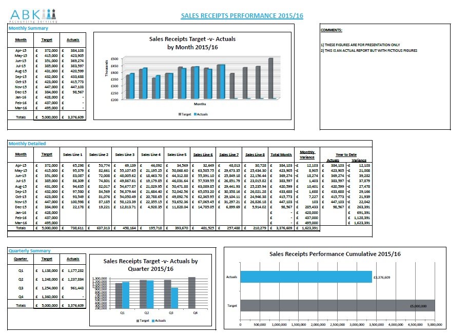
Although the report was comprehensive enough some people found it confusing and although the information was there, the presentation needed improving. Additionally, the report was a little bit labour intensive as the data was drawn from other spreadsheets manually and then input manually into a further spreadsheet. An obvious omission to the report was any form of graph for instant indication of actual performance against the monthly, quarterly and annual targets.
By working with a small team from the main target audience I was able to recreate the report in a new spreadsheet, creating links to the source data from other spreadsheets and show:
- Actuals against monthly target
- Actuals against quarterly target
- Actuals against annual target
The information was presented in figures and graphs for all the above targets, with a detailed breakdown for those who needed it and formatted and structured so if fit onto one A4 landscape page with a comments box for KPI narrative. The end result was:
- An accurate report with information presented in both numerical and graphical format
- A timely report that was fast and efficient to produce and issue
- A consistent report so that the target audience could focus quickly on information
Reporting attributes: Accurate, Timely and Concise
The old style report (not shown) generated regular queries, was prone to errors and omissions due to duplicity and was labour intensive in that data already input was input again. The new report was linked to the source data via the monthly detailed section of the report, which in turn updated the monthly and quarterly summaries and all the graphs. If you wanted to see progress at a glance you would use the monthly, quarterly or annual graphs for a visual representation. If wanted to review actual figures, they were there in summary by month, quarter and year to date with a detailed breakdown if you wanted to break it down further.